
When it comes to tea tin design trends, you no longer have to choose between a vintage floral pattern or a modern minimalist label.
Today, design impacts how well consumers identify flavors, how packaging performs in physical stores and online images, how efficiently one mold can serve multiple SKUs, and whether sustainability or digital-engagement claims hold up in practice.
At Jinyu, we’ve seen these shifts play out across hundreds of tea tin projects. Below are nine trends that combine visual identity with manufacturability — based on what our clients are actually ordering and what we've learned on the production floor.
| Design trend | Main visual direction | Best suited to | Practical production route | Key consideration |
| Quiet premium minimalism | Clean typography, restrained color, generous space | Matcha, wellness tea, premium private labels | Matte coating, Pantone colors, simple embossing | Needs one distinctive brand element to avoid generic look |
| Tactile contrast | Embossing, debossing, matte-gloss contrast, exposed metal | Premium loose leaf, gift products | Formed lid decoration, spot varnish, textured artwork | Two well-executed finishes often outperform five |
| Modern heritage | Botanical drawings, archive-inspired graphics, regional storytelling | Black tea, oolong, heritage blends, souvenirs | Offset printing with selective metallic details | Cultural imagery must be accurate and legally usable |
| Expressive color systems | Bright color blocking, flavor-led palettes | Fruit tea, herbal blends, younger retail ranges | CMYK or Pantone flavor variants | Color consistency between physical tin and online image is critical |
| Collectable editions | Coordinated series, seasonal artwork, numbered collections | Gift sets, discovery ranges, limited editions | One mold with several printed designs | Each artwork requires its own print setup and MOQ |
| Digital packaging | QR codes linking to origin, brewing, traceability | Export brands, information-heavy tea products | Printed QR code or GS1 Digital Link | Must test code size, contrast, and surface curvature on metal |
| Refill and reuse design | Durable graphics, clear secondary use, refill compatibility | Loose leaf tea, kitchen storage, premium retail | Refillable inner pouches, long-life tin graphics | Reusability claims need a realistic reuse pathway |
| Modular tea systems | Stackable tins, coordinated sizes, compartment packs | Multi-flavor sets, tea samplers | Existing stackable molds or fitted dividers | More components increase tolerance and packing complexity |
| Accessibility-first packaging | Clear hierarchy, readable type, stronger contrast | Mainstream retail, export, multilingual ranges | Structured front panel, controlled typography | Decorative scripts and low contrast reduce readability |
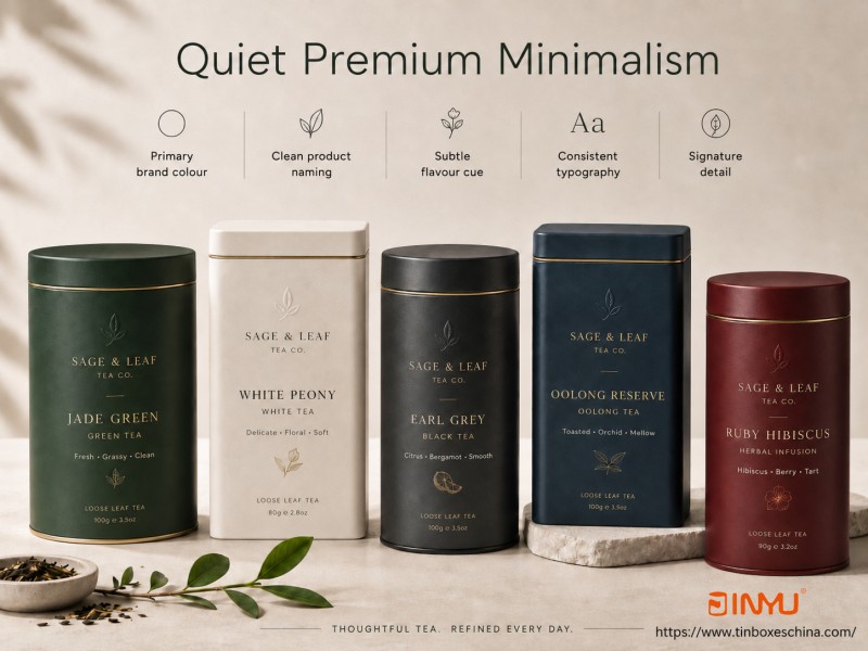
Minimalist tea packaging is still relevant, but the direction has shifted. Early minimalist designs relied on a plain white background and a small logo. That approach has become easy to imitate and hard to defend as a brand asset.
A modern minimalist tea tin needs a recognizable system, not just fewer graphics.
Elements that work together:
One primary brand color
Product name in a consistent position
A subtle flavor indicator
Generous space around the logo
Consistent typography across the range
One signature detail — an embossed leaf, an exposed-metal line, or a single geometric mark
Muted cream, deep green, charcoal, warm white, and dark blue are popular for premium tea. But minimalism doesn't require neutral colors. A clean design built around a single rich jewel tone can still command attention on a retail shelf.
What we've observed in production:
Last year we produced a matcha tin series for a Japanese brand using deep matte green with one small blind-embossed leaf. The client initially wanted the embossed area to be 35mm wide, but our sampling showed that on a 65mm diameter round lid, anything above 20mm created visible distortion near the curved edge. We reduced it to 18mm and the result was sharper and more tactile. The same mold now serves three matcha grades, with only the product name changing — not the structure or finish.
Guidance for buyers:
Use a common artwork architecture across multiple flavors. Keep the logo, product name, and net-weight position constant, then vary one controlled color or a single flavor indicator for each SKU. This keeps design fragmentation low and helps customers navigate the range quickly.
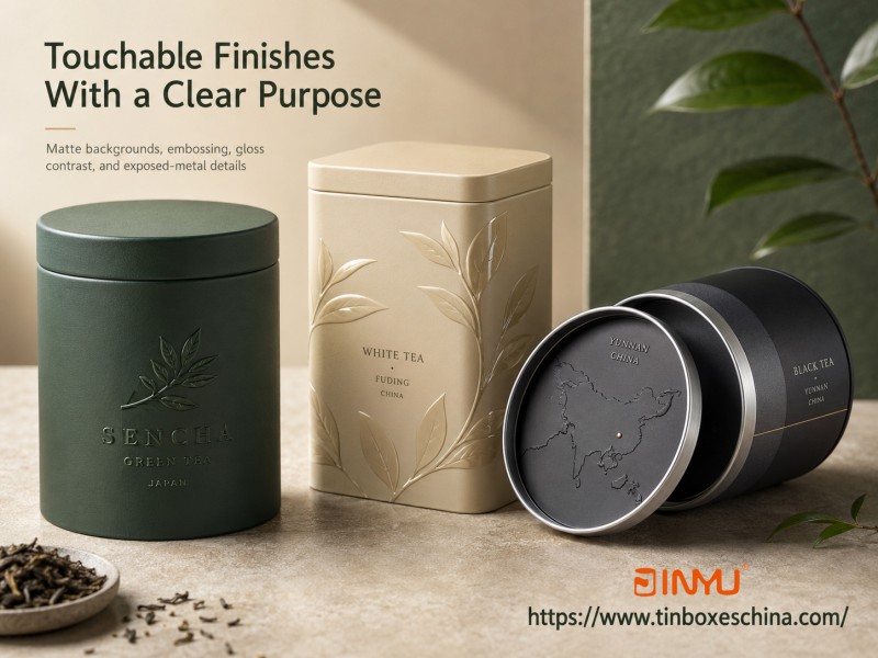
Embossing, debossing, matte coatings, gloss effects, and textured surfaces are strong directions in tea tin packaging. The customer handles a tea tin before opening it, and a well-executed tactile detail can communicate quality faster than any label claim.
A practical haptic system might combine:
Matte background
One embossed logo
Gloss leaves on the matte field
A thin exposed-metal line
An unprinted silver rim detail
A recessed origin map
A contrast between two finishes nearly always outperforms five decorative processes applied at once.
Where embossing should and shouldn't go:
Based on our tooling experience, avoid placing embossing near:
Lid fitting edges
Hinges
Threaded screw necks
Plug-lid contact areas
Deeply drawn corners
Narrow rolled seams
We recently rejected a client's artwork that placed a large embossed logo 2mm from the lid rim. During forming, even a 0.5mm material shift can cause the embossed area to touch the edge, creating both a visual defect and a lid-fitting problem. We now recommend a minimum 8mm clearance from any seam or rim for embossed elements above 0.3mm relief depth.
A note on soft-touch coatings:
Soft-touch finishes feel warm and premium but are more prone to showing fingerprints, surface rub, and handling marks than conventional matte varnish. We always recommend a transport simulation test — pack six finished tins in the actual shipping carton, vibrate or shake for 30 minutes, and inspect the surfaces. Approving from a digital rendering alone is risky.
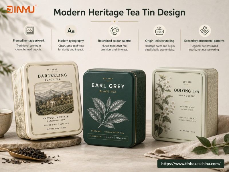
The 2026 direction isn't simply "make it vintage." It's modern heritage: historical references with a cleaner contemporary layout.
Approaches that work:
Engraving-style tea leaves paired with modern typography
Traditional landscape art placed inside a simplified label frame
Vintage botanical illustrations with restrained color palettes
Heritage brand dates combined with a modern information hierarchy
Regional patterns used as a secondary ornament rather than full-surface decoration
This direction works well with Earl Grey, English Breakfast, oolong, black tea, white tea, origin-specific collections, and brands with genuine heritage stories.
A project example:
We produced a Darjeeling black tea tin for an Indian estate brand. They supplied an original 1940s estate illustration and wanted it printed across the entire lid. We recommended placing the illustration inside a centered 70mm × 50mm frame on a cream background, with the estate name in clean sans-serif below. The side panel carried brewing instructions in the same typeface. The client reported that the framed treatment made the vintage artwork feel curated rather than simply reproduced, and the design performed well across both specialty retail and online product photography.
Cultural imagery requires care:
Chinese calligraphy, Japanese patterns, Indian motifs, and British heritage scenes should not be used interchangeably as generic signs of "premium tea." Artwork must connect to the actual tea origin, brand story, or target market. Brands should also confirm they own or have licensed the rights to any historical artwork. Mass-produced tins can have a hand-painted or woodcut look, but should never be described as individually hand-painted unless that's literally true.
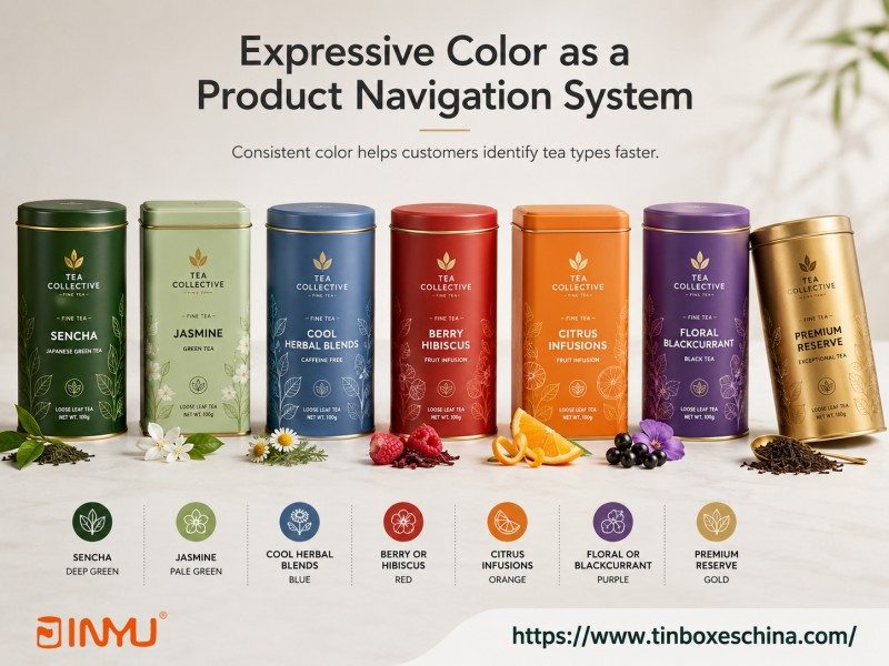
Bright color in packaging attracts attention and creates an emotional lift. With tea tins, color becomes most commercially useful when it helps customers navigate a range.
A flavor-color mapping we've seen work consistently:
Sencha — deep green
Jasmine — pale green
Cool herbal blends — blue
Berry or hibiscus — red
Citrus infusions — orange
Floral or blackcurrant — purple
Premium reserve — gold
The color system must stay consistent across the lid, body, retail carton, and online product images. A mismatch between the physical tin color and the e-commerce photo is a common source of customer confusion and returns.
Pantone or CMYK?
Pantone spot colors are valuable when a brand needs to control an identity color precisely across multiple production runs. CMYK works well for fruit illustrations, landscapes, watercolor art, and photographic elements. Some projects use CMYK artwork plus one Pantone color for the brand mark — this adds cost but ensures the logo stays exact.
Our production advice on color:
Always approve color from a printed metal sample, not a screen. Ink on white-coated tinplate reflects light differently than a backlit display. We've seen a deep navy Pantone approved on screen that printed almost black on metal because the client hadn't accounted for the substrate's reflectivity. A physical sample in natural and retail lighting avoids this.
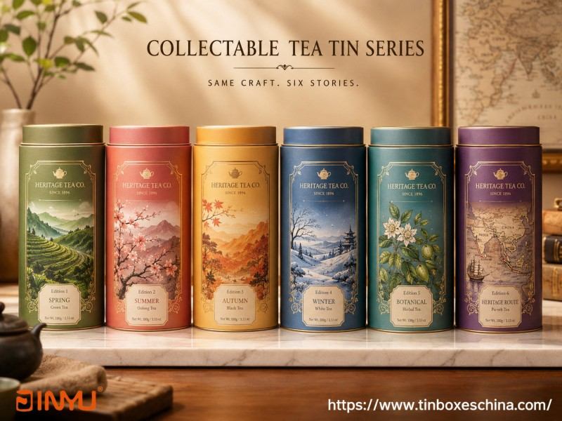
Tea tins naturally suit collectible packaging because customers can keep and reuse the container. The strongest collection systems follow a clear structure:
Same tin shape
Same logo position
Same typeface family
A repeating decorative frame
One changing element — color, character, location, or ingredient
Sequential numbering to define the series
Collection formats we've produced:
Six tea-growing regions
Four seasons
Botanical ingredient sets
Historic tea trade route maps
City souvenir tins
Festival or zodiac editions
Artist collaboration series (three designs per release)
Mold strategy:
A collection doesn't require a new metal shape for every design. It's almost always more economical to use one existing mold and change only the printed artwork. This also simplifies outer carton planning and shelf presentation.
What to check on MOQ:
Five designs with a total order of 5,000 pieces may not be handled the same way as one 5,000-piece design. Each artwork requires its own print plate setup and has a minimum order quantity per run. We've had clients plan an eight-design collection with 1,000 pieces per design — this is doable but the per-unit print setup cost is higher than running 5,000 pieces of one artwork. Ask your supplier to quote both scenarios so you can make an informed decision.
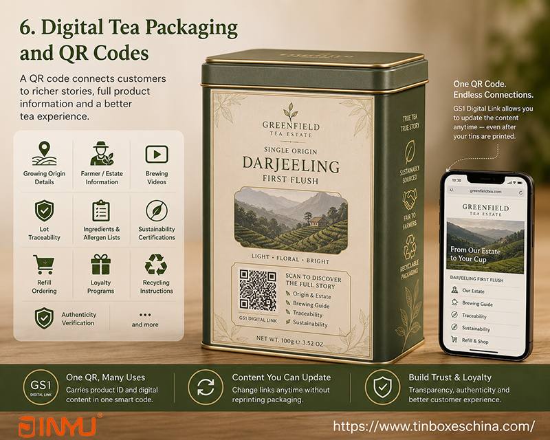
A tea tin has limited physical space, especially when a brand needs to include ingredients, brewing instructions, origin details, and text in multiple languages.
A QR code can link customers to:
Growing origin details
Farmer or estate information
Brewing videos
Lot traceability
Ingredient and allergen lists
Sustainability certifications
Refill ordering
Loyalty programs
Recycling instructions
Authenticity verification
GS1 Digital Link enables a single QR code to carry both product identification and online content. A resolver or redirect system can change the linked destination without changing the printed code — useful for updating content across already-printed inventory.
Our testing checklist before bulk printing:
We recommend a minimum 15mm × 15mm printed QR code size on tinplate. On a recent project, a client's 12mm code printed over a glossy varnish became unreadable under retail spotlighting. We moved the code to a matte area and increased it to 16mm. It scanned reliably from then on.
Also test for:
Black-on-white contrast (not dark grey on cream)
No embossing or texture within the code area
Surface curvature — round tins need the code placed on the flattest section
Landing page maintenance — a dead link is worse than no code
Retail barcode compatibility — not all point-of-sale systems read 2D codes yet; GS1 currently recommends keeping a traditional 1D barcode until the transition completes
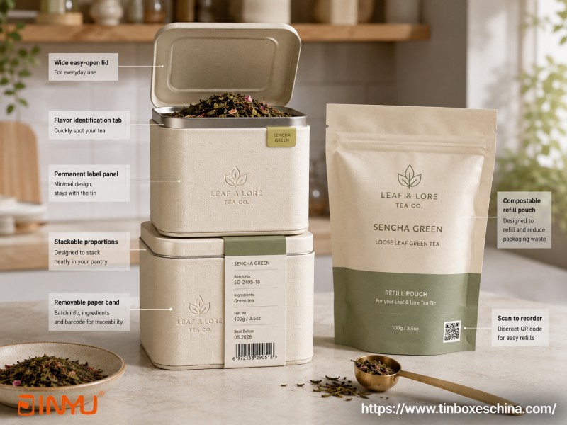
Sustainability is often presented as a visual trend — recycled-paper colors, kraft-style graphics, bamboo accents, or claims that tinplate is endlessly recyclable.
The more powerful strategy is to design a packaging system that customers can actually reuse or refill.
A refill-oriented tea tin might include:
A standardized inner pouch size
A label panel that remains valid after refilling
A wide opening for easy filling and cleaning
Stackable dimensions
A flavor identification tab
A QR code linked to refill ordering
Artwork that isn't tied to a short-term promotion
The EU Packaging and Packaging Waste Regulation sets lifecycle requirements for packaging minimization, recyclability, reuse, and labeling. It advances design-for-recycling standards, not just general environmental statements.
A practical example:
We produced a square kitchen storage tin for a loose-leaf tea brand launching a refill program. The tin was a warm cream with a subtle linen-texture finish and a small embossed logo. No seasonal markings, no discount claims. A removable paper band carried batch info, ingredients, and barcode — this band is discarded when the tin moves into home storage use. Refills sold in compostable pouches. The client's repeat refill orders grew steadily because the tin remained desirable and season-neutral.
Mixed materials aren't automatically more sustainable:
Adding a bamboo lid, cork panel, plastic window, magnet, ribbon, or foam insert may improve appearance but can also hinder separation and recycling. For any added component, ask: Can it be removed? Does it interfere with the steel recycling stream? Is it genuinely needed for product protection? Does it deliver enough customer value to justify the material? Could the same effect be achieved through printing or embossing instead?
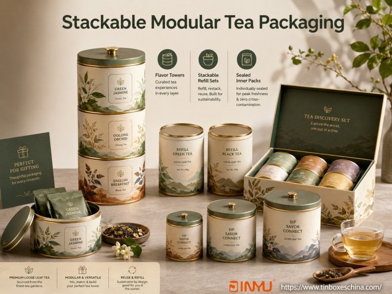
Modularity works best for tea brands when it solves a real product problem.
Useful formats we've manufactured:
Three-tiered flavor towers
Two stackable refill canisters
One box of mini tea tins with coordinated artwork
Sample boxes with removable partitions
Small, medium, and large coordinated canisters
Tea tins sized to fit a standard gift carton
This trend is especially relevant for tea discovery sets, seasonal gifts, corporate tea selections, travel packs, assorted loose-leaf origins, and sorted flavored tea bags.
Structural consistency is critical:
A stackable tin requires exact dimensional tolerance. In our experience, even a 0.3mm deviation in lid diameter can cause stacking instability or difficulty separating tins. We run a fit test on every batch — stack three tins, tilt the stack 15 degrees, and confirm they remain stable without binding.
If different loose teas share one set, each tea needs its own sealed inner pack or closure to prevent aroma cross-contamination. Total height, center of gravity, outer carton dimensions, and transport stability must all be tested before finalizing the structure.
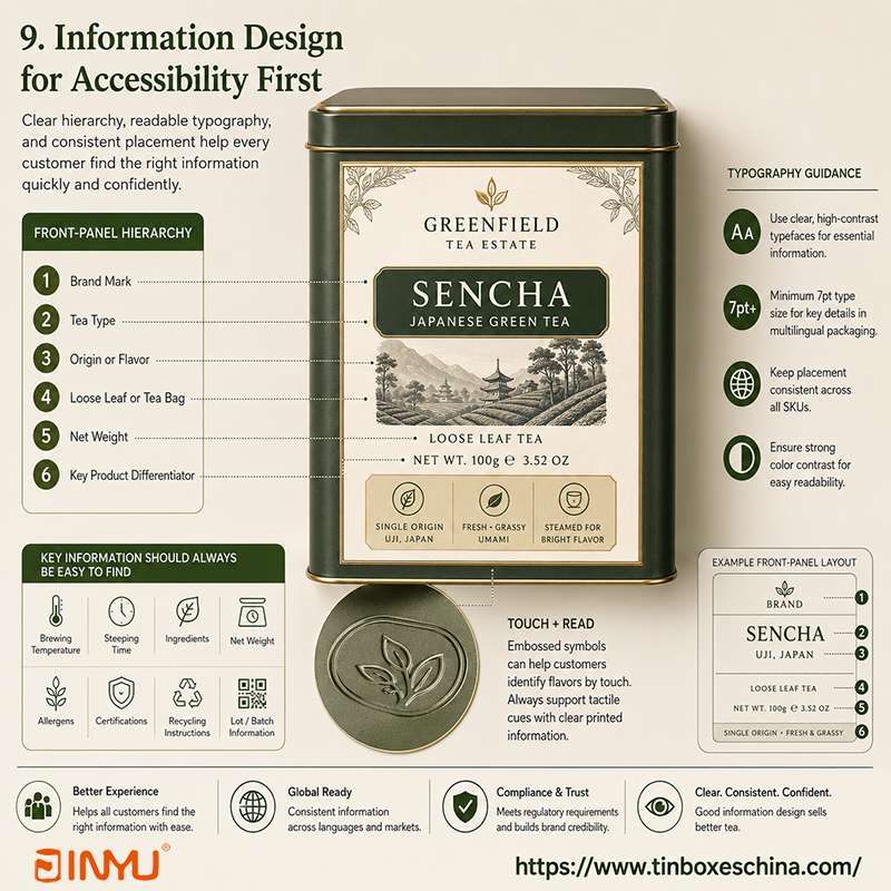
Accessibility-first packaging doesn't mean removing visual identity. It means making critical information easier to find and read.
A useful front-panel hierarchy:
Brand mark
Tea type
Origin or flavor
Loose leaf or tea bag
Net weight
Key product differentiator
Secondary information can move to rear or side panels.
Typography guidance from our production experience:
Fine scripts can work for a collection name but are harder to read for brewing temperature, steeping time, allergen information, net weight, and regulatory text. For multilingual export packaging, strong color contrast, a minimum 7pt type size for essential information, and consistent placement across SKUs are especially important.
Embossed symbols can help consumers differentiate flavors by touch, but tactile graphics should supplement printed information rather than replace it.
| Tea product or brand position | Recommended direction | Suitable finish or feature | Watch out for |
| Premium matcha | Quiet minimalism with precise origin info | Matte finish, small embossed mark, deep green | Large windows, cluttered fruit graphics |
| Heritage black tea | Modern heritage, restrained metallic details | Botanical engraving, gold lines, embossed logo | Unrelated cultural motifs |
| Herbal or fruit infusion | Expressive flavor colors, ingredient illustration | Gloss highlights, bright CMYK, color coding | Unsupported health claims |
| Premium loose leaf gift | Tactile contrast, collectable series | Double-lid structure, matte finish, selective embossing | Too many finishes on one lid |
| Mainstream tea bags | Accessibility-first layout | Hinged rectangular tin, clear flavor navigation | Small scripts, excessive front-panel copy |
| Seasonal tea collection | Coordinated limited-edition artwork | One existing mold, several printed designs | New tooling for every seasonal SKU |
| Corporate tea gift | Branded design with digital layer | Logo embossing, QR code, gift sleeve | Individual names printed directly in low quantities |
| Multi-flavor sampler | Modular or compartment format | Dividers, mini tins, independently sealed packs | Loose teas sharing one unsealed space |
| Refill program | Durable, timeless design | Wide opening, standard refill pouch, reorder QR | Artwork tied to a single short-lived promotion |
A transparent window lets customers see the product but reduces the opaque printable area. Windows are more practical for individually wrapped tea bags, sealed inner pouches, or gift sets with mini tins. For delicate loose leaf or matcha, consider light exposure before committing to a large window. The plastic window also adds a material to manage for recycling and separation.
Exposed tinplate, transparent colored ink over metal, printed metallic effects, and metallic lacquers can create strong shelf impact. But large mirror-like surfaces show scratches, fingerprints, and photo reflections easily. We often suggest limiting high-reflection areas to borders or accents rather than full-lid coverage.
Book-shaped boxes, elaborate doors, magnets, and multi-layer trays look impressive in a 3D render but add assembly labor, component count, packing volume, quality control checkpoints, freight costs, and recycling complications. We often suggest starting with what can be assembled and packed efficiently, not just what looks best in the render.
Standard tinplate printing uses one repeated artwork per production run. Individual names, serialized messages, or unique per-customer artwork require a different method — variable data printing on paper wraps, printed insert cards, laser marking, laser engraving, or applied stickers. A product described as "personalized" must clearly state what can change and at what minimum quantity.
Let your supplier know if the product will sell through supermarkets, specialty tea shops, gift stores, online marketplaces, or corporate-gift channels. A design that looks elegant in a lifestyle photograph may not stay readable on a crowded supermarket shelf.
Specify what the tin will contain: loose leaf tea, matcha, tea bags, individually wrapped packets, a sealed inner bag, or multiple individual flavors. Visual design approval depends on understanding the internal packaging and required label information.
Decide on shape, size, and lid system before production design begins. Artwork must accommodate lid rims, body seams, hinges, rolled edges, embossed surfaces, corners, plug-lid contact areas, and screw threads. Placing a paper-box artwork file directly onto a metal dieline often results in text distortion or misaligned graphics.
Determine which features all products will share and which may change. A well-controlled tea range might keep the same logo placement, product name field, typeface family, border, and side-panel layout. Ingredient illustration, origin name, and flavor color can then vary by SKU.
Request pricing for the base design and then each additional process individually. For example: standard four-color printing, plus Pantone color, plus matte lacquer, plus embossed logo, plus spot gloss, plus inside-lid printing, plus paper sleeve, plus gift carton. This makes it easier to evaluate which features justify their cost.
Check: color in natural and retail lighting, typography after forming, embossing alignment, lid movement, QR code scannability, scratch and fingerprint resistance, digital photography performance, carton protection, and shelf visibility next to competing products. A rendering communicates the idea. A sample communicates the finished metal surface.
| Complexity level | What's included | Typical application |
| Standard | Existing mold, one printed artwork, standard matte or gloss varnish | Single-SKU tea products, private label |
| Medium | Multiple flavor artworks, Pantone color, embossed logo, exposed metal details, inside-lid printing, paper sleeve, retail display carton | Flavor ranges, gift sets, premium retail |
| Complex | New custom mold, special shape, clear window, multi-layer sets, magnets, varied inserts, hand assembly, variable personalization | Limited editions, luxury gifts, multi-component sets |
A tin that looks simple can still feel premium. Often a disciplined artwork and a single well-executed finish produce a stronger result than a complicated structure with several competing features.
The most relevant directions are quiet minimalism, tactile finishes, modern heritage artwork, expressive color systems, collectable editions, QR-enabled packaging, refill-led design, modular gift formats, and accessibility-first information design.
Yes, but generic minimalism is becoming harder to differentiate. The successful minimalist tin usually has one identifiable color, symbol, embossed element, or typography system that supports brand ownership.
No. Heritage design remains relevant when genuinely connected to product origin or brand story. Cleaner typefaces and restrained layouts help keep a vintage-inspired tin from feeling dated.
Yes. One mold can support several printed designs. Check with your supplier on minimum order quantities and print setup costs for each artwork — multiple designs in smaller quantities carry higher per-unit costs than one design at full volume.
Embossing can add tactile recognition, but its value depends on placement and execution. A small raised logo often works better than embossing the entire lid.
A QR code is useful if the brand has meaningful content that won't fit on the tin — brewing guidance, origin details, traceability, or refill ordering. It must link to a maintained, mobile-friendly page and be tested on the final printed sample.
They can be used, but the window reduces light protection and adds another material. A window is more practical when the tea is in an opaque inner pouch or individually wrapped sachets.
No. Real environmental performance depends on material weight, production methods, freight, regional recycling infrastructure, and whether customers actually reuse the container. Design for realistic reuse, not generic eco-friendly claims.
An existing tin mold with a clear visual system, controlled flavor colors, and one distinctive finish. This is easier to manage than a new custom shape or a complex multi-component gift box.
Every tea packaging trend needs to answer a commercial question.
Minimalism can add clarity. Color can organize flavors. Embossing can provide tactile recognition. Heritage art can communicate origin. QR codes save limited packaging space. Modular structures can turn several teas into a gift collection.
The right direction depends on your tea, your target market, your sales channel, your order quantity, and your long-term product range.
Jinyu provides end-to-end support for custom tea tin projects: existing mold selection, tinplate printing, color matching, embossing, lid development, sampling, mass production, and export packing.
To get started, tell us your tea type and a rough quantity. We'll suggest the closest existing mold, provide tray layout options, and prepare a digital mockup — typically within 48 hours.
Holen Sie sich die neuesten Informationen und Sonderangebote


 IPv6-Netzwerk unterstützt
 Deutsch
 English
 Français
 Español
 Português